The city council got a look at the latest options for a new branding logo for Bainbridge Island at its meeting Tuesday, but enthusiasm for the new logos was in short supply from council members.
The council declined to give the proposed city logo designs a thumbs up, and instead said the public should weigh in on the proposed options.
The latest logo designs were created by Bainbridge graphic designer Kelly Hume, and included one to replace the logo currently used by the city that features the Bainbridge ferry and a forest and mountain background.
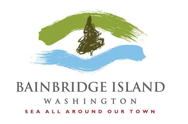
The new logo that would be shared by Bainbridge businesses – which features a tree in the center with paintbrush splashes of green and blue on the top and bottom – is part of a months-long project to “brand” Bainbridge for economic development and increased tourism. City and business officials hope the shared local logo will help create a “community identity” for visitors to Bainbridge, and result in a consistent marketing effort for the island.
The project also included a chance to refresh the “corporate logo” for Bainbridge Island government, said Kellie Stickney, city spokeswoman.
 Four options were presented for a new city logo, two that depicted a capital B with the inside of the letter blocked out by an outline of the island. The other two versions were two squares with the letter B and an island outline, or four blocks with two additional squares with the numbers 2 and 5, representing the city’s 25th anniversary.
The latest logos mark a do-over by city hall. Logo designs created by a consultant firm based in South Carolina drew widespread criticism from islanders when they were revealed earlier this year. City officials then decided to relaunch the logo project using a local designer.
The new designs received a muted reception from council members.
“It’s better than shields,” said Councilman Val Tollefson, referring to the much ridiculed earlier design that featured three medieval battle axes on a shield.
A few council members asked why they were even being asked for a vote on the logos.
Stickney said one logo – to be used by local businesses, nonprofits and others – did not require the city’s OK.
The city logo, however, was different.
Some on the council indicated they wanted community feedback before signing off on a new city logo.
“I have a hard time reacting to something on the spot that I’m just seeing,” said Councilman Mike Scott.
It’s important to allow people the chance to speak up, he said.
“I’m surprised you’re asking us to make a choice,” said Councilwoman Sarah Blossom, adding that the council had not seen the logo designs before the meeting.
The council ultimately decided to let the logo designs “percolate for a while,” Scott said.
“Let’s let this get out in the public,” he said.

